Great ideias for your house! Here you have 6 color ideas for Interiors that will refresh your home decor as well as make you revitalized.
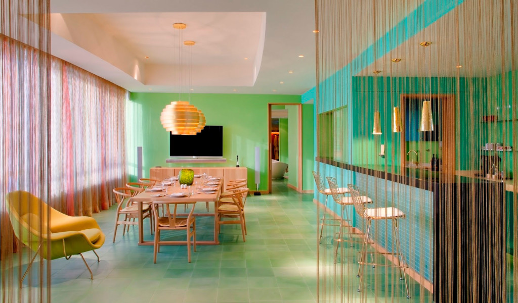
Bright colors
An interior mixed with bright colors offers any space a hip and stylish vibe, with plenty of abundant light to create a fresh atmosphere. Such color palette can be used with striking patterns that will stark contrast between its own colors. Though this can be a very efective way to make your home brighter, it’s also not easy to pull off. Be careful when trying this color scheme, advise yourself first.
 Hotel Missoni in Kuwait City, Kuwait.
 Modern and Classy Interiors.
 A Canadian Media Company.
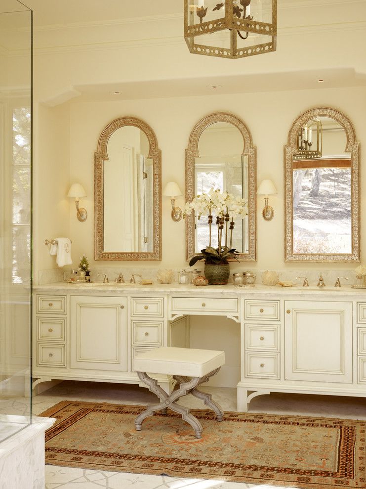
Neutrals
Designing with a neutral palette can be timeless; it makes a home look elegant, yet effortless. With a neutral palette, one can spice up a room with just a subtle pop of modernity in color or décor. Purely neutral color palettes are made up of nothing but white, grays and blacks. If you relax this rule a little, neutral color schemes can also include browns as well as mixtures of cream and beige.
 The Wiesergut Hotel.

 Bill Bensley for the Intercontinental Hotel in Danang, Vietnam.
Monochromatic color scheme
A monochromatic scheme uses different values (tints, shades, tones) of only one colour, with the possible addition of white, black, and grey. Monochromatic schemes are easy to get right and can be very effective. Monochromatic schemes with large white areas give a fresh, serene look – e.g. white walls and ceiling, bleached timber floor, and furniture in variations of the same colour.

Cool monochromatic schemes are soothing and peaceful, and make rooms appear larger than they really are. Use different values – from light to dark – to create interest and give depth to the interior.
Complementary color scheme
Complementary colours are colours located opposite each other on the colour wheel; when used together, they enhance and complete each other. In complementary colour schemes, you usually choose one colour as your main colour, and its opposite as an accent. For an elegant look, use a saturated colour against a muted one; if you prefer bold schemes, choose intense colours against a neutral background.


Triadic color scheme
The triadic colour scheme uses three colours equally spaced around the colour wheel. Use this scheme if you want your room to offer both a strong visual contrast and a balanced, harmonious look. You can have triads consisting of blue, magenta (red-purple) and yellow (gold), for example. It’s up to you how to make this color scheme work with your room.


Source: Romantic Homes Magazine
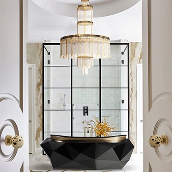
Brass – Color and materials
“I’m crushing on brass! I love how it revs up any space. It’s timeless and affordable. What’s not to like?” —Melissa Rufty


These tips will transform your home interiors in a classy and luxurious way! Play with colors and placement for a brand new home environment.

Follow Best Design Projects and subscribe our Newsletter.